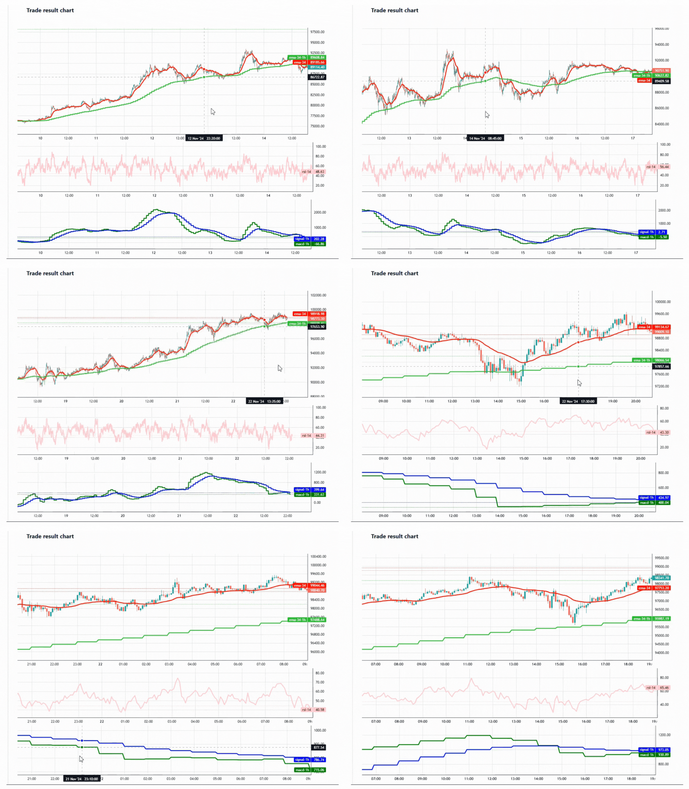
Draw Indicators on Backtest Report Charts
Overview
The ability to visualize indicators on backtest report charts is a powerful feature for traders who want to validate their trading algorithm ideas.
By displaying indicators directly on the charts, users can visually inspect their algorithm's performance and gain deeper insights into market behavior.
This feature is especially useful for quickly identifying patterns, crossovers, or anomalies that may influence trading decisions.
How it works
-
Main Chart:
The main report chart displays candlesticks derived from the primaryBarSeries. The chart's interval aligns with the main interval used during backtesting. -
Indicator Charts:
All indicators displayed on the chart must align with the chart's main interval. For example, if your backtest's main interval is 5 minutes, but you want to include an indicator calculated on a 1-hour interval, the indicator will be adjusted (aligned) to match the 5-minute chart interval. Tools are provided to handle this alignment seamlessly. -
Chart Types:
- Overlay Charts: Indicators appear directly on the main candlestick chart. For example, moving averages or Bollinger Bands overlay the candlestick data.
- Non-Overlay Charts: Indicators appear on separate panels below the main chart. This is ideal for indicators like RSI, MACD, or volume-based metrics.
Example Setup
Let’s explore an example to understand how this feature works in practice.
Backtest Configuration
Exchange : Binance Future
Coin : BTCUSDT
Main candle interval : 5m
Support candle intervals : 1h
Date from: 2024-01-01
Date to: 2024-11-21 .
Indicators to Visualize
-
Overlay Indicators:
EMA(34): A 34-period Exponential Moving Average aligned with the 5-minute chart.EMA(34) - 1 Hour: A 34-period EMA calculated on the 1-hour timeframe but aligned with the 5-minute interval for visualization.
-
Non-Overlay Indicators:
RSI: A Relative Strength Index line displayed on a separate panel.MACD - 1 Hour: A MACD indicator calculated on the 1-hour timeframe and displayed on a separate panel.
Bot Implementation Details
The indicators visualization in handled in the init method of your bot.
@Override
public void init(Map<String, String> map) {
   BarSeries barSeries = getBarSeries();
   BarSeries barSeries1h = otherBarSeries.get(Duration.ofMinutes(60));
   ClosePriceIndicator closePrice = new ClosePriceIndicator(barSeries);
   ClosePriceIndicator closePrice1h = new ClosePriceIndicator(barSeries1h);
   EMAIndicator ema = new EMAIndicator(closePrice, 34);
   RSIIndicator rsi = new RSIIndicator(closePrice, 14);

   EMAIndicator ema1h = new EMAIndicator(closePrice1h, 34);
   MACDIndicator macd1h = new MACDIndicator(closePrice1h, 12, 26);
   EMAIndicator signal1h = new EMAIndicator(macd1h, 9);
   // draw ema34 line
   Plot ema34 = new Plot("ema-34").withColor("red").withIndicator(ema).withStyle(PlotStyle.LINE)
                                  .withPricePrecision(2);
   // draw ema34_1h line
   Plot ema34_1h = new Plot("ema-34-1h").withColor("#32CD32").withIndicator(ema1h).withStyle(PlotStyle.LINE)
                                        .withPricePrecision(2);

   // create main chart . **Overlay = true**
   Chart chart = new Chart("MainChart");
   chart.setOverlay(true);
   chart.setPlotList(Arrays.asList(ema34, ema34_1h));

   // draw rsi line
   Plot rsi14 = new Plot("rsi-14").withColor("#FFC0CB").withIndicator(rsi).withStyle(PlotStyle.LINE)
                                  .withPricePrecision(2);
   // create RSI chart , it should be separate chart then **overLay=false*
   Chart rsiChart = new Chart("RsiChart");
   rsiChart.setOverlay(false);
   rsiChart.setPlotList(Arrays.asList(rsi14));

   // draw macd-1h line
   Plot macd_1h = new Plot("macd-1h").withColor("green").withIndicator(macd1h).withStyle(PlotStyle.LINE)
                                     .withPricePrecision(2);
   // draw signal-1h line
   Plot signal_1h = new Plot("signal-1h").withColor("blue").withIndicator(signal1h).withStyle(PlotStyle.LINE)
                                         .withPricePrecision(2);

   // create macd chart , it should be separate chart then **overLay=false*
   Chart macdChart = new Chart("MacdChart");
   macdChart.setOverlay(false);
   macdChart.setPlotList(Arrays.asList(macd_1h, signal_1h));
   // Important part : Add charts to chart list
   this.setChartList(Arrays.asList(chart, rsiChart, macdChart));

}
def init(self, config: Dict[str, str]) -> None:
  nd_closes = numpy.array(self.bar_series.closes, dtype=np.double)
  self.rsi = abstract.RSI(nd_closes, 14)
  self.ema34 = abstract.EMA(nd_closes, timeperiod=34)

  self.bar_series_1h = self.other_bar_series[60]
  nd_closes_1h = numpy.array(self.bar_series_1h.closes, dtype=np.double)
  self.macd, self.macdsignal, self.macdhist = abstract.MACD(nd_closes_1h, fastperiod=12, slowperiod=26,
                                                               signalperiod=9)
  self.ema34_1h = abstract.EMA(nd_closes_1h, timeperiod=34)

  # create main chart
  main_chart = Chart(is_overlay=True, name="Main Chart")
  main_chart.add_plot(Plot(name="ema34", color="#FFB3BA", bar_series=self.bar_series,
                              indicator_values=numpy.nan_to_num(self.ema34).tolist()))
  main_chart.add_plot(Plot(name="ema34-1h", color="#BAFFC9", bar_series=self.bar_series_1h,
                           indicator_values=numpy.nan_to_num(self.ema34_1h).tolist()))

  # create rsi chart
  rsi_chart = Chart(is_overlay=False, name="RSI")
  rsi_chart.add_plot(Plot(name="rsi", color="#FFDFBA", bar_series=self.bar_series,
                          indicator_values=numpy.nan_to_num(self.rsi).tolist()))

  # create macd chart
  macd_chart = Chart(is_overlay=False, name="MACD")
  macd_chart.add_plot(Plot(name="MACD", color="#BAFFC9", bar_series=self.bar_series_1h,
                           indicator_values=numpy.nan_to_num(self.macd).tolist()))
  macd_chart.add_plot(Plot(name="MACD-SIGNAL", color="#FFFFBA", bar_series=self.bar_series_1h,
                           indicator_values=numpy.nan_to_num(self.macdsignal).tolist()))

  # Important part : Add charts to chart list
  self.chart_list.append(main_chart)
  self.chart_list.append(rsi_chart)
  self.chart_list.append(macd_chart)
Interpretation of Results
- Candlestick chart with
EMA(34)andEMA(34) - 1 Hourplotted on the same panel. - Panel 1:
RSIline for a detailed view of overbought or oversold conditions. - Panel 2:
MACD - 1 Hourshowing the MACD line, signal line, and histogram.
Conclusion
As you see the draw chart feature help us understand the market better. Just little bit of coding is required in practice and you are ready to go.